
Is Your Logo the Right Color?
In the world of branding and design, color isn’t just a visual element; it’s a powerful tool that can evoke emotions, convey messages, and shape perceptions. From the vibrant energy of red to the calming nature of blue, each color has its own psychological associations that can significantly impact how a brand is perceived by its audience. In this blog post, we delve into the fascinating realm of color theory and explore how it influences the feel and essence of a brand.
What is color theory?
Color theory is a field of study that examines how colors interact with each other and how they can be used to create harmonious and impactful designs. It explores the psychological effects of colors on human emotions and behaviors, offering insights into why certain hues elicit specific responses from people.
The Role of Color in Branding
When it comes to branding, color is more than just an aesthetic choice; it’s a strategic decision that can shape the entire identity of a brand. Colors have the power to communicate brand values, establish brand personality, and create memorable experiences for consumers.
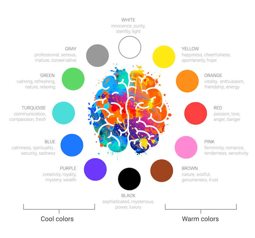
Red: The Color of Energy and Passion
One of the most attention-grabbing colors in the spectrum, red is often associated with energy, passion, and excitement. Brands that use red in their logos or branding materials often want to convey a sense of urgency or boldness. Take, for example, Coca-Cola, one of the most iconic brands in the world. The vibrant red of its logo is synonymous with energy, fun, and the joy of sharing moments with friends.
Blue: Trust, Stability, and Serenity
On the opposite end of the spectrum, blue is a color often chosen by brands seeking to convey trust, reliability, and professionalism. Think of Facebook, IBM, or Samsung—all of these tech giants use shades of blue in their logos to establish a sense of security and dependability. Blue is also associated with calmness and serenity, making it an excellent choice for brands in the healthcare or wellness industries.
Yellow: Optimism and Cheerfulness
Yellow is the color of sunshine, evoking feelings of optimism, happiness, and warmth. Brands that incorporate yellow into their branding often want to create a cheerful and inviting atmosphere. Look at brands like McDonald’s or IKEA—both use yellow prominently in their logos to convey a sense of friendliness and affordability.
Green: Nature, Growth, and Health
As the color of nature, green is often associated with growth, freshness, and health. Brands that want to emphasize their eco-friendliness or connection to the environment often choose shades of green in their branding. Whole Foods Market is a prime example, using various tones of green to convey its commitment to organic, sustainable products.
Purple: Luxury, Royalty, and Sophistication
Purple has long been associated with royalty, luxury, and sophistication. Brands that want to convey a sense of elegance and exclusivity often incorporate purple into their logos and branding materials. Take, for instance, Cadbury, whose iconic purple packaging suggests a rich, indulgent experience.
Orange: Adventure, Creativity, and Enthusiasm
Orange is a color that exudes warmth, enthusiasm, and creativity. Brands that want to appeal to adventurous spirits or convey a sense of innovation often turn to orange. The Home Depot, for example, uses orange in its logo to suggest energy, excitement, and the thrill of home improvement projects.
Black: Elegance, Power, and Mystery
Black is a timeless color that exudes elegance, power, and sophistication. Brands that want to convey a sense of luxury and exclusivity often use black in their branding. Think of Chanel, Nike, or Apple—all of these brands use black to create a sleek and premium image.
Pink: Playfulness, Femininity, and Compassion
Pink is often associated with femininity, playfulness, and compassion. Brands that want to target a female audience or convey a sense of empathy and care often use shades of pink in their branding. Barbie, for example, uses pink to create a playful and fun image that appeals to young girls.
The Power of Color
Color theory is a powerful tool in the hands of brand designers and marketers. By understanding the psychological associations of different colors, brands can effectively communicate their values, establish their personality, and create meaningful connections with their target audience. Whether it’s the bold energy of red, the calming nature of blue, or the playful spirit of pink, each color carries its own unique message that can leave a lasting impression on consumers. So, the next time you see a brand’s logo or packaging, take a moment to consider the colors used—it might just reveal more about the brand than you think.
